Designer: Taylor Gattermayr
Title: Vintage Orchid Skincare
Medium: Illustrator
Size:
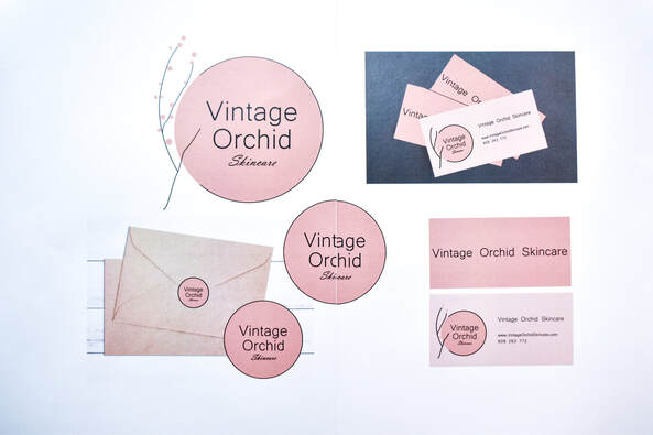
I decided to create a skincare line including a logo and packaging. The design features a vintage and minimalistic aesthetic. I was able to turn my ideas into a successful logo designed in illustrator by following the design process of brainstorming, creating a brief, researching, analysing, and exploring ideas.
I experimented with practical application and designed multiple designs for a possible final design. Some designs included plants to represent the sustainable products, and others included a beach aesthetic. After reviewing my designs, one specific design stood out to me. I developed my design skills in the graphic design field by putting my ideas onto paper, experimenting with different colours and themes, and my drawing skills. Throughout the process of producing my final design I improved my skills within using illustrator, I was able to problem solve and my schools have also been renewed since using it in design last year.
One designer who heavily influenced my design was Kati Forner. She is a designer who creates logos and packaging for brands such as ‘Muse + Metta’’ and ‘Simple Goods’. Forner has an aesthetic of minimalism and elegance which really caught my eye, knowing I wanted to follow her style. I took inspiration by creating a simple and minimalistic logo as well as using a very limited colour palette. The colour pink was taken as inspiration from Forner designed brands ‘Kombucha Culture’ and ‘Wilding’.
The brief outlined that the design was to be a new skincare design which includes a brand name and logo. The logo had to include the name and type of brand had to be represented in the logo. I achieved this by adding the brand name into the logo and adding a plant representing the sustainable product. The logo had to be simple and vintage, I achieved this by creating a minimalistic logo with fewer colours and writing and adding a diluted pink as the background to add a vintage aesthetic. It was finally outline for the logo to not be busy, have no bright colours, and have no cursive or hard to read lettering. Although I was successful in not making the logo busy and not having bright colours, I was unsuccessful by using cursive in my design, however the cursive is not hard to read.
One major challenge I faced whilst creating my final design was that I wanted to add a rustic, grainy, diluted look to add a more vintage look. After spending hours on attempting to put this look on the background, I could not figure it out, so I decided to leave it out which was a huge risk as my logo was aimed to be a vintage style. If I was to create this logo again, I will get help from an art teacher so I can achieve my design successfully.
Overall, I believe my design successfully represented minimalistic and vintage as well as being natural. Throughout the design process, I developed my illustrator skills, practical skills, and creativity skills.
Title: Vintage Orchid Skincare
Medium: Illustrator
Size:
I decided to create a skincare line including a logo and packaging. The design features a vintage and minimalistic aesthetic. I was able to turn my ideas into a successful logo designed in illustrator by following the design process of brainstorming, creating a brief, researching, analysing, and exploring ideas.
I experimented with practical application and designed multiple designs for a possible final design. Some designs included plants to represent the sustainable products, and others included a beach aesthetic. After reviewing my designs, one specific design stood out to me. I developed my design skills in the graphic design field by putting my ideas onto paper, experimenting with different colours and themes, and my drawing skills. Throughout the process of producing my final design I improved my skills within using illustrator, I was able to problem solve and my schools have also been renewed since using it in design last year.
One designer who heavily influenced my design was Kati Forner. She is a designer who creates logos and packaging for brands such as ‘Muse + Metta’’ and ‘Simple Goods’. Forner has an aesthetic of minimalism and elegance which really caught my eye, knowing I wanted to follow her style. I took inspiration by creating a simple and minimalistic logo as well as using a very limited colour palette. The colour pink was taken as inspiration from Forner designed brands ‘Kombucha Culture’ and ‘Wilding’.
The brief outlined that the design was to be a new skincare design which includes a brand name and logo. The logo had to include the name and type of brand had to be represented in the logo. I achieved this by adding the brand name into the logo and adding a plant representing the sustainable product. The logo had to be simple and vintage, I achieved this by creating a minimalistic logo with fewer colours and writing and adding a diluted pink as the background to add a vintage aesthetic. It was finally outline for the logo to not be busy, have no bright colours, and have no cursive or hard to read lettering. Although I was successful in not making the logo busy and not having bright colours, I was unsuccessful by using cursive in my design, however the cursive is not hard to read.
One major challenge I faced whilst creating my final design was that I wanted to add a rustic, grainy, diluted look to add a more vintage look. After spending hours on attempting to put this look on the background, I could not figure it out, so I decided to leave it out which was a huge risk as my logo was aimed to be a vintage style. If I was to create this logo again, I will get help from an art teacher so I can achieve my design successfully.
Overall, I believe my design successfully represented minimalistic and vintage as well as being natural. Throughout the design process, I developed my illustrator skills, practical skills, and creativity skills.