Designer: Caitlin Schmidt
Title: Roseate Eau de Parfum
Medium: Vector Illustration on Card
Size: 43 x 62cm
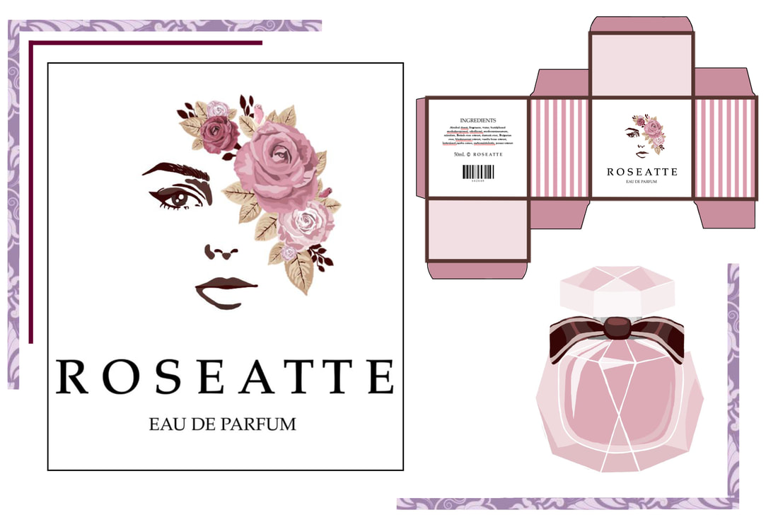
Initial strong interest in product packaging began my exploration of this design style, following a brief from body shop company Roseatte that required a perfume box pattern/logo and bottle design reflecting elegance and the main scent rose, with blackberry, rosewood and vanilla undertones. The bottle required a crystal-like texture and shape, whilst both packages needed to target young-adult feminine audiences and stylised by minimalism to portray luxury.
Throughout my folio I experimented with vector styles like gradients and illustration. Illustration appealed to me most as it created the smooth texture I desired. In the logo, done using digital pen, I captured the most distinctive features of a young lady’s face (eyes and lips). These limited features, influenced by minimalism and emphasised by vast background negative space, were created to target my audience. Additionally, roses, due to being socially renowned for being symbols of love, sophistication and elegance became my logo focal point. These were illustrated in a symmetrical headband arrangement to create balance and reflect elegance and the main scent. Their rounded organic shapes illustrate the gentle flow of the petals and leaves, whilst overlapping the feminine features to imply the perfume masks you in its elegant fragrance.
The typeface below this logo used for Roseatte Eau de Parfum is connected to Nicholas Jenson’s 1400’s Venetian font. Historically, he created this font as an elegant version of the Roman typeface used in newspapers, as its bold lettering was easy to read. Like the venetian font, my typeface exhibits small flourishes to create subtle movement. Comparatively, mine is monospaced for visibility and purpose. It also features thinner lines with thicker stems to create a delicate and elegant appearance.
The bottle, inspired by designer brand Flowerbomb’s geometric bottle, furthers this idea and takes on a shape similar to a bomb ready to explode and cover you in scent. The layered sharp edged triangles, inspired by illustration designer Tom Whalen who uses layered geometric shapes of different palette shades to show shadow and sharp action, help fulfill the crystal-like texture and shape required. A satin ribbon finishes its appearance to add a sense of movement and colour.
Using colours and artificial patterns I wanted to reflect the undertones and continuation of elegance for both box and logo. To do this, I investigated and was heavily influenced by Vittorio Reggianini’s painting The Coquette’s Adventure. Its warm floral note colours (defined using the perfume colour wheel) created a dark and light contrast throughout the design to avoid colour clash. These were pale pink to represent rosewood, subdued gold to represent vanilla and earthy maroon to illustrate blackberry. The stripes of a Coquette’s dress, defined in Parisian culture as “the essence of French elegance”, also inspired me. Initially, the box appeared dull as my logo on the front limited its detail. I used the stripes as a contrast on the sides to add colour and a classy mood that resolved this.
Overall, I wanted to communicate these products as high quality through elegance. Despite my design not being fully minimalist, the movements influence on the limited feminine features and maximising of vast negative space achieves this as it eliminates playful detail. Feminine subject matter targets its audience and use of space, colour, shape and symbolism effectively fulfills Roseatte’s brief by reflecting the perfume scent and required elegance.
Title: Roseate Eau de Parfum
Medium: Vector Illustration on Card
Size: 43 x 62cm
Initial strong interest in product packaging began my exploration of this design style, following a brief from body shop company Roseatte that required a perfume box pattern/logo and bottle design reflecting elegance and the main scent rose, with blackberry, rosewood and vanilla undertones. The bottle required a crystal-like texture and shape, whilst both packages needed to target young-adult feminine audiences and stylised by minimalism to portray luxury.
Throughout my folio I experimented with vector styles like gradients and illustration. Illustration appealed to me most as it created the smooth texture I desired. In the logo, done using digital pen, I captured the most distinctive features of a young lady’s face (eyes and lips). These limited features, influenced by minimalism and emphasised by vast background negative space, were created to target my audience. Additionally, roses, due to being socially renowned for being symbols of love, sophistication and elegance became my logo focal point. These were illustrated in a symmetrical headband arrangement to create balance and reflect elegance and the main scent. Their rounded organic shapes illustrate the gentle flow of the petals and leaves, whilst overlapping the feminine features to imply the perfume masks you in its elegant fragrance.
The typeface below this logo used for Roseatte Eau de Parfum is connected to Nicholas Jenson’s 1400’s Venetian font. Historically, he created this font as an elegant version of the Roman typeface used in newspapers, as its bold lettering was easy to read. Like the venetian font, my typeface exhibits small flourishes to create subtle movement. Comparatively, mine is monospaced for visibility and purpose. It also features thinner lines with thicker stems to create a delicate and elegant appearance.
The bottle, inspired by designer brand Flowerbomb’s geometric bottle, furthers this idea and takes on a shape similar to a bomb ready to explode and cover you in scent. The layered sharp edged triangles, inspired by illustration designer Tom Whalen who uses layered geometric shapes of different palette shades to show shadow and sharp action, help fulfill the crystal-like texture and shape required. A satin ribbon finishes its appearance to add a sense of movement and colour.
Using colours and artificial patterns I wanted to reflect the undertones and continuation of elegance for both box and logo. To do this, I investigated and was heavily influenced by Vittorio Reggianini’s painting The Coquette’s Adventure. Its warm floral note colours (defined using the perfume colour wheel) created a dark and light contrast throughout the design to avoid colour clash. These were pale pink to represent rosewood, subdued gold to represent vanilla and earthy maroon to illustrate blackberry. The stripes of a Coquette’s dress, defined in Parisian culture as “the essence of French elegance”, also inspired me. Initially, the box appeared dull as my logo on the front limited its detail. I used the stripes as a contrast on the sides to add colour and a classy mood that resolved this.
Overall, I wanted to communicate these products as high quality through elegance. Despite my design not being fully minimalist, the movements influence on the limited feminine features and maximising of vast negative space achieves this as it eliminates playful detail. Feminine subject matter targets its audience and use of space, colour, shape and symbolism effectively fulfills Roseatte’s brief by reflecting the perfume scent and required elegance.