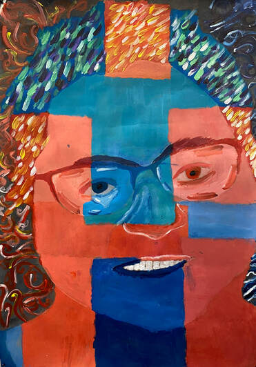
Artist: Ashlee Griffiths
Title: Untitled
Medium: Acrylic on card
Size: 44 x 57cm
My initial concept was working with emotion using colour and tone. I started off with looking at different artist and the reason and way they produce their work. The artists I look at were Henri Matisse, Vincent Van Gogh because of his use of lines in background and his overall work for my work background, Andy Warhol because of the big block of colours and lines for my middleground and Richard Lewer because of flatness in his work for my foreground. I arrived at my image by choosing a picture of someone in my family, after thinking about I found a picture of my mum I could use.
I have research different artist, first I looked at Lewer and I have looked at his cultural context in aboriginal lands and people for example his work “Muuki Taylor” made in 2015. I have looked at Van Gogh and I have look at his historical context because of the fact he was a big person in history and a big part the movements in he painted for one piece of work like post- impression, for example “starry night” made in 1889. Lastly, I looked at Warhol and his social context and the fact he was a part of a big social movement pop art, one of his works I liked is “Marilyn Monroe” made in 1962.
I kept the main idea with the portrait and emotion which was a strong idea. I did more researching and looked at the more artist, this helped me came up with different ideas to talk about and the ways to the feeling of my work, which made the idea grow and evolve which help improve my major. The artist that influenced my ideas for my major the most was Matisse and his piece of art “the portrait of madame Matisse, the green line” which is a portrait of Matisse’s wife.
The art elements and principles I have use is line, colour, shape and movement. I use line for the background and the hair, I use little thick line for the hair and wavy circular lines for the background. I use colour to show the different area for the face, one major idea I did was making the eyes droopy in one of the blue sections. I used shape by sectioning off space in the face by drawing rectangles and squares. Lastly, I showed movement by using my brush in different brush strokes ways as such in the hair and highlights with the white and blend colours e.g. the warm or cool colours.
I had the problems with how to include each key ideas from each artist I wanted, I got past this by making sure I had it written in a note to look at or in my head to remember for every time I continue with my major, overall I am happy with how I turn out and I feel like I got the idea across and way I wanted I to look.