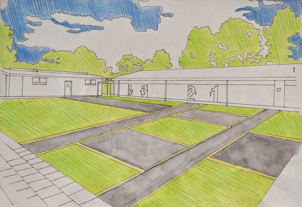
Designer: Matt Birchmore
Title: Nuriootpa Football Club Space
Medium: Watercolour on paper
Size: 42 x 29.5 cm
When beginning my folio, I wanted to produce a train station for a new city development in the futurist style. But after being approached by the local football club, I changed my major to still focus on futurist architecture but applied to public space design to create a new space for the club. I contacted the president of the football club, the client, to collect information for a brief. They described that they wanted a simple space, designed to efficiently guide the movement of people through the area.
Researching futurism provided the base for my design, detailing what materials could be used and how to layout my design to better compensate for the movement of people. Futurist architect Antonio Saint’Elia provided helpful insight into how I can layout my major design. His design philosophy of making designs as efficient to move through as possible, provided many ideas for how my design can more efficiently influence the movement of people. I adopted Saint’Elia’s use of looping and branching paths in my own major but adjusted the idea to better fit a smaller public space. Saint’Elia’s designs are great for their efficient movement, but the materials used disconnect the futurist style to what the client wants. Since the client preferred a design without any trees or benches, paving was the one feature that I could use to make the design standout and to do this I used a gold and charcoal paving design. This paving choice was the client’s preference from a selection of choices that I compiled from the Art Gallery of South Australia’s front space and the Nuriootpa High school and football club area. Looking at the works of C+S architects, especially Piazza del Cinema I could better understand the relationship between paving and environment. Despite the paving in Piazza del Cinema matching that of its environment the relationship was still prominent, this prominence inspired me to use paving as a tool to make my design standout.
When creating the drawing for the space, keeping the theme of simplicity in mind, I used water colour to produce a base layer of colour, this base was then hatched over with coloured pencil in a variety different shades to make the drawing better standout. This was done for natural objects (trees, grass, and sky) to better emphasis their colours. Unlike the built environment that was left uncoloured to better draw attention to the space, the sky and background trees were coloured to bring more colour to this piece. Due to the lack of features in this design, the upper section of my major needed to be coloured as the lack of colour would have made the end result more unappealing due to an unfinished look.
The looping and interlocking path design in my major, use of simple techniques and materials accompanied by the lack of features such as trees or benches better communicates that this space is purely transitional, meeting the design brief and small budget while creating a simple space that the client will find appealing.